Finding the right profile picture for your site, reposted from @PHrbacek
By tweeting this syndicated post, you can earn promotional tweets from me as part of the Amazon Tweet Exchange.
Details here.
Details here.
 |
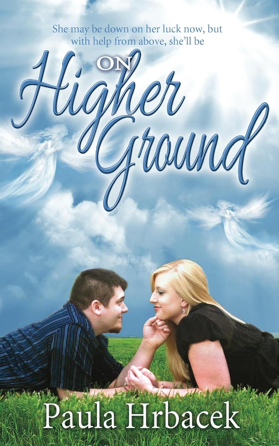
| Cover links to Amazon.com |
Book reviewers, editors and agents will often check an author’s social media sites to see what type of person they are dealing with. First impressions count, so it’s important to choose a photo for your portrait that communicates who you are and what you do.
Author Cindy Christiansen writes sweet romance. Her portrait is professionally done, and looks romantic. Before you take a professional portrait, check the contract. Some studios maintain the copyright to their photos, while others don’t. Be sure that your contract includes print rights to the photo.
 Not everyone can afford a professional shoot. There are other choices. A wedding is a good opportunity if the couple has chosen a photographer that sells all the rights to the photos. A professional photographer will have the appropriate lighting to conceal wrinkles and glare. He or she will know how to pose the subject to eliminate a double chin, slouch or frown. Most people are dressed up and looking their best at a wedding, and that is a plus, too for some people. But check with the photographer about copyright first. Some sell all the rights to the couple, and some don’t.
A party is another occasion when people get dressed up. My portrait was taken at a girl’s night out party. An Avon lady did all of our hair and makeup, giving me a makeover. I asked a friend to take headshots, but she didn’t have talent for taking photos. All of her shots looked like mug shots. Then another friend, who used to work for a photographer and has an eye for good poses, snapped my picture when I wasn’t paying attention. I wish I had smiled more, but it’s the best photo I have, so that’s the one I use.
If you ask a friend to take a photo, try to choose one who has talent. Aileen Cook writes YA novels and has a daughter who is a talented photographer. Her profile picture is a snapshot taken with a point and shoot camera, but her daughter posed the picture to make it look professional.
Alan Alford published a book about being a successful salesman. His photo looks like it was taken by a newspaper photographer. Most newspaper photographers will sell the reprint rights to a photo for about $25 or so. That’s cheaper than a studio, and still provides a professional shot. What is nice about Alan’s photo is that the photographer included all of his shoulders in the shot. Shoulders communicate hard work and responsibility, so while it is not a good choice for everyone, the extra width of the photo helps communicate what Alan’s book is about.
Cropping can help communicate who you are. Most photos have a ratio of half and half, or two thirds face and one third background. Being too close to the camera violates personal space and makes the viewer feel uneasy. It communicates “getting in your face” because it looks like the person is standing nose to nose. On the other hand, too much background and being too far away from the camera communicates being unfriendly, aloof, distant and remote. But certain authors can get away with a wider shot. For instance, if the author writes about travel, a background of a tourist location would help communicate what they do better than a studio portrait.
The focal point of any photo or work of art is located about two thirds up from the bottom, and just right of center. In a portrait, the focal point should be the eyes. Making eye contact communicates trust and confidence. Vicky Hinze has a birth defect in her eyes, so she sometimes uses a broad-rimmed hat to cover them up. She writes suspense novels and the hat makes her look like a spy. She is an exception to the eye contact rule because the hat fits her genre and makes her look at attractive.
Facial expressions can also be used to communicate what type of writing the author does. Michael Elliot, who writes about a cat that solves murder mysteries, has a profile photo with a mischievous grin. His fiction is humorous, so the expression helps communicate his genre.
Clothing can also communicate who you are. Rainy Kaye writes steamy, dark novels. She uses a low-cut dress and bedroom eyes to help communicate how hot her novels are. Bette Stevens writes children’s books, and uses an expression and clothes that look like a teacher or librarian.
If you’re not sure what your portrait communicates, post a discussion about your profile on one of your social media sites and ask your followers if the photo communicates what you want it to. Keep an eye out for opportunities to find a better shot if you need to. It doesn’t have to be professional (unless you’re an executive) but it should be effective.